This article provides a visual summary of simple and multiple linear regression. Simple linear regression involves regressing a response variable Y to a single covariate X. In multiple linear regression, there are many covariates (or explanatory variables), e.g. X1, X2, X3, etc.
Generally, linear regression may be appropriate if the response variable is continuous (numerical). The covariates may be either categorical (factor variables) or continuous. We will focus on continuous variables in this case, but the extension to factor variables is quite simple.
We require cross-sectional data (data over a slice of time or where time is not a factor). If time is one of the variables, then linear regression is generally not appropriate as the observations are not dependent. (Instead, to study these kinds of data sets, we need tools from an area known as time series.)
There are, of course, further checks necessary to confirm whether linear regression is suitable, which we will discuss in this article.
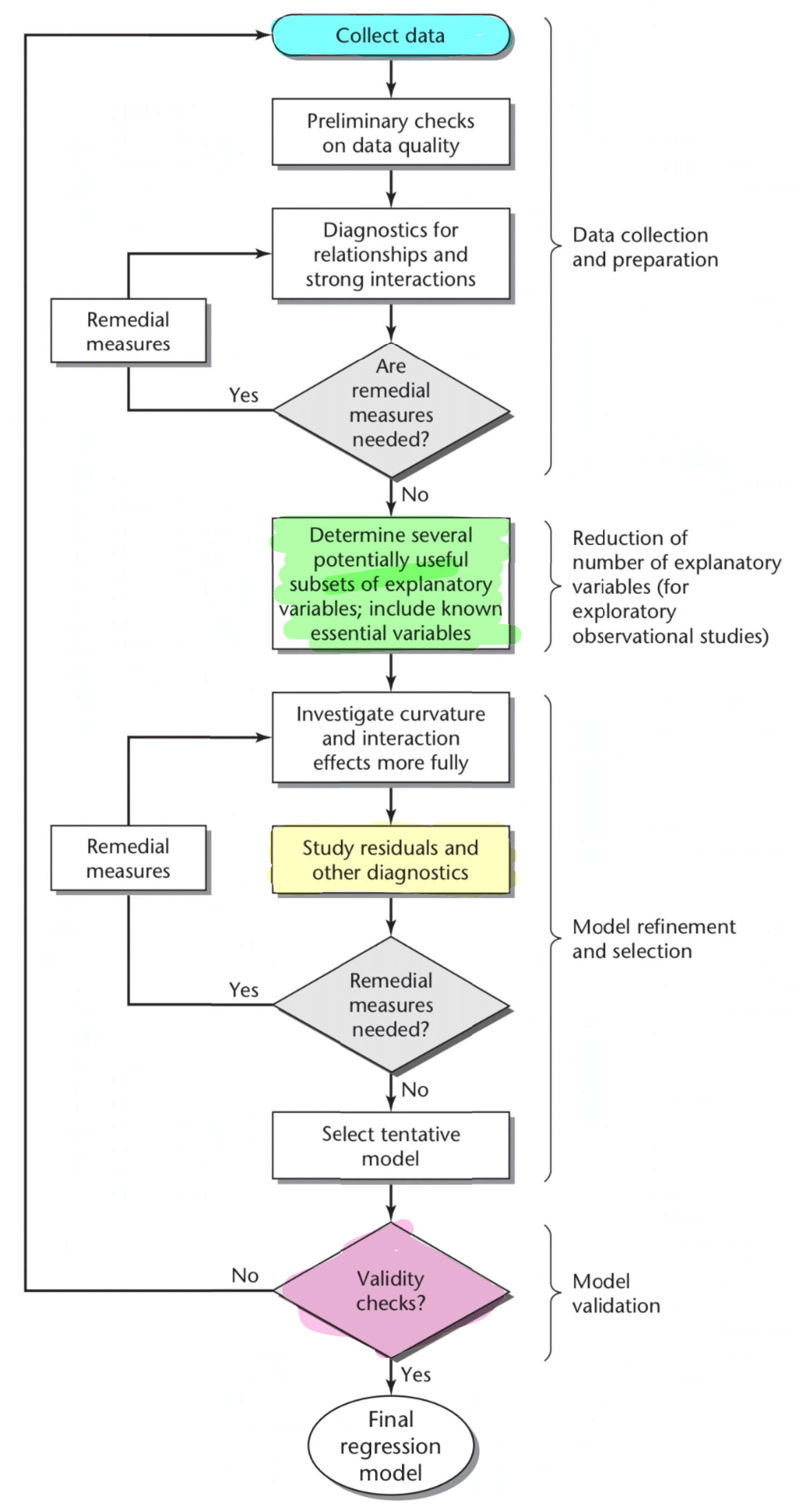
Below is an outline of the overall process for creating regression models. This image below is Figure 9.1 from the 4th Edition of Applied Linear Regression Models by Kutner, Nachtsheim and Neter (2004).
Note: An alternative model is discussed briefly in Appendix 1.
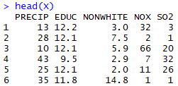
Our data set (ex1123 from R package Sleuth3)
The dataset we will use as our main example is called concerns whether pollution causes human deaths. This data came from 5 Standard Metropolitan Statistical Areas (SMSA) in the United States, obtained for the years 1959-1961. The response/dependent variable is “total age-adjusted mortality from all causes” (mortality), which is measured in deaths per 100,000 population. The explanatory variables include
- mean annual precipitation (in inches);
- median number of school years completed, for persons of age 25 years or older;
- percentage of 1960 population that is nonwhite;
- relative pollution potential of oxides of nitrogen, NOx; and
- relative pollution potential of sulphur dioxide, SO2, where
- “relative pollution potential” is the product of the tons emitted per day per square kilometre and a factor correcting for SMSA dimension and exposure.
Source: G.C McDonald and J.A. Ayers, “Some applications of the ‘Chernoff Faces’: A technique for graphically representing multivariate data“, in Graphical Representation of Multivariate Data, New York, 1978
1. Collect data
We have already chosen a dataset but, in general, data can be collected in many ways, such as via surveys, experiments or observations.
The theory behind survey and experimental is extensive. For example, survey questions should be designed so as not to influence respondents towards a particular choice. Additionally, the way the population is sampled is important. Two problems in sample design are selection bias and non-response bias.
Another concern is whether the observations are independent. For example, if we are measuring blood pressure, then it would be inappropriate to measure both a person and that person’s mother, because it is not independent (in a genetic sense).
2. Preliminary checks on data quality
Checks we can perform on the data include looking at minimum and maximum values, and figuring out what you want to do with errors in the data or missing values. A typical choice is whether you want to fill in missing values with a set value (such as the average data value, called “imputation”) or to remove observations that include missing values altogether. This will depend on the context of your data.
Errors might include:
- Someone gives something in metres rather than centimetres
- One particular measuring device breaking and giving very large values compared to other measuring devices of the same model
- Something affects quite a significant proportion of your data set, e.g. a satellite needs to see through clouds, but how thick do the clouds have to be before we start throwing away data? (We might not have the resources to collect more data)
- Sometimes missing data may encoded as a chosen number like -9999, which should be fixed before continuing
3. Diagnostics for relationships and strong interactions
3a. Exploratory data analysis
Initial exploratory data analysis is important, such as checking what form the data takes. For example, one common consideration is whether there are categorical variables.
Some initial indications of the distribution of the data (even checking for outliers) can be gained by performing various plots such as plotting Y against X, using stem-and-leaf plots, boxplots, etc.
3b. Using scatterplots and the correlation matrix
Next follows a number of steps to find the best variables to include in our model. We will also analyse whether we should transform our variables for a better fit. Note that you may already have a model in mind. (See Appendix 2.)
We perform a scatterplots below that include all explanatory variables and the dependent variable (mortality).
The plot may reveal a number of things. For example, if one of the X’s can be considered in terms of “levels” rather than a continuous variable, the plot may indicate whether this is appropriate (the plot may suggest that there should be two regression lines, differing by a constant term). You can check for this kind of effect by using different plotting symbols.
Note: In Part 5, we check SLR/MLR model assumptions, but some aspects can be identified in these scatterplots.

The individual relationships here are not necessarily of strong importance, but we do generally want to check for collinearity among the covariates.
We can also check correlation matrix to look at relationships between dependent and independent variables, or between independent variables.

(Note: Using the scatterplots and correlation matrix, we can also look at whether any of the X variables are highly correlated to check multicollinearity. We will discuss multicollinearity more in step 4.)
This data suggests some issues with NOX and maybe SO2. However, the pairs plot should really be seen as ‘windows’ into a building – they certainly cannot tell the whole story. In particular, they cannot depict a relationship between more than two variables at the same time.
(As discussed in step 3a, apart from the plots below, you can also consider stem-and-leaf plots, boxplots, etc.)
In general, in the case of a single covariate (simple linear regression), we can discern six cases, where the first case is the one that does not require alteration. There is no simple extension of this diagram for multiple linear regression.

Source: Display 8.6 from the 3rd Edition of The Statistical Sleuth by Ramsey and Schafer (2013), p.214 of Chapter 8: A Closer Look at Assumptions for Simple Linear Regression
Both NOX and SO2 appear to fall into the category “means curved, standard deviations increasing”.
Identifying which case we have from the 6 cases above may save us time compared to looking at a large number of plots. However, this plot is not so useful for multiple linear regression because it doesn’t take into account the other covariates.
Based on our diagnostics, since logarithm (log) transformations are linearising and variance-stabilising, one reasonable conclusion is to take the log of both NOX and SO2. However, let us not perform this transformation yet, as we will wait and see what happens when we perform variable selection (step 4). If our dataset were extremely large, we may hedge our bets now and perform the transformation right away.
From the plots above, or general intuition, we can also think about including interaction terms, squared terms or higher order polynomial terms.
Note: Though resource-consuming, we can also check whether interaction terms, squared terms or higher order polynomial terms are significant using variable selection techniques (Step 4). We will attempt to do this in our example.
Note: You should also consider producing plots that identify patterns in the data more clearly, such as symbol plots or co-plots.
Note: Specifically for simple linear regression, code such as the following can be helpful.
Ymat = cbind(Y, log(Y), sqrt(Y), 1/Y)
Xmat = cbind(X, log(X), sqrt(X), 1/X)
Ynames=c(“Y”, “log(Y)”, “sqrt(Y)”, “1/Y”)
Xnames=c(“X”, “log(X)”, “sqrt(X)”, “1/X”)
par(mfrow=c(4,4))
for(i in 1:4) {
for(j in 1:4) {
plot(Xmat[ , i], Ymat[ , j], xlab=Xnames[i], ylab=Ynames[j])
}
}
This plots various transformations of the response against various transformations of the explanatory variable. The plot may appear in low/narrow resolution on some computers. You can alter the code to choose to only plot 4 or 9 graphs rather than 16.
4. Determine several potentially useful subsets of explanatory variables include known essential variables / Investigate curvature and interaction effects more fully
(Note: In preparation for step 4a on multicollinearity, it may be possible to consider “de-meaning” or “centering” the data. This involves subtracting the mean of each variable from each observation, making the average of each transformed variable zero. This may help with the regression fitting in some instances, particularly when statistics software finds it hard to work with very large numbers.)
Most models should include known essential variables and usually some correlation between explanatory variables are unavoidable. We can also think about including interaction terms, squared terms or higher order polynomial terms.
We can include squared terms or interactions in the pool of potential variables if they logically belong in the model. The higher order terms and interaction terms could be eliminated by variable selection.
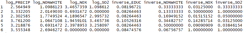
The example below is something you can use if the dataset isn’t too big and the number of explanatory variables isn’t too large. We can see that R puts a dot and a number at the end to indicate each new transformation of that variable.
For sake of simplicity, interaction terms were not included here, but they may well be useful if we think that two covariates vary together (e.g. in a study on economic data, race and income may vary together).

(Note: remember from step 3b, Display 8.6, it is also possible to transform the Y variable.)
Clearly we can see the following correspondence
- VARIABLE: No transformation
- VARIABLE.1: Squared
- VARIABLE.2: Logarithm
- VARIABLE.3: Square root
- VARIABLE.4: Inverse
Note: We can also use added variable plots to assess whether or not an additional explanatory variable should be added to a multiple regression model (see Appendix 3).
4a. Checking for and fixing multicollinearity using “variance inflation factors”
Multicollinearity is the problem that arises because one or more of the explanatory variables are highly correlated. This can, for example, result in overly large standard errors, meaning you won’t reject null hypotheses a lot of the time.
Though we can check our scatterplots and correlation matrix from earlier (ignoring anything involving the dependent variable, mortality), a more robust method is to use “variance inflation factors” (Hastie, Tibshirani, Witten & James, 2013).
Below, we look at the Variance Inflation Factor (VIF) values for our model.

A heuristic cutoff value for VIF is 5 or 10 (Hastie, Tibshirani, Witten & James, 2013). It has also been given as simply 10 (Ramsey and Schafer, 2013).
Keep removing one variable at a time then recalculating VIFs until no VIF values are above 5 or 10.
Notes:
- The package used for VIF is called “car”.
- Multicollinearity can also be analysed using principal components analysis (PCA), among other tools. The VIF method is preferred. However, PCA can allow you to define your own explanatory variables as combinations of existing potential explanatory variables.
- PCA can also be used to estimate the ‘effective dimension’ of the covariate space, since generally we prefer models with fewer explanatory variables (the ‘principal of parsimony’).
In the end, we chose the variables shown below.
4b. Variable selection (with cross validation)
Now that we know what transformations we want to make, there are various variable selection (or feature selection) techniques that allow us to narrow down our pool of independent variables.
In a data set with a large number of covariates compared to the number of observations, lasso regression is a frequently-used variable selection method. Here, we talk about stepwise methods as they are fairly simple to understand.
This step can be very computationally extensive. In cases where such computation time is very limited, you may want to consider steps 5a and 5b first.
The data should first be split into training (large) and test (small) sets using various methods, which can be complex. This is part of the “cross validation” process.
4bi. Variable selection: Stepwise method (option 1)
| Forward | Backward | |||
| Criteria A | Criteria B | Criteria A | Criteria B | |
| F-stat | Stop if j=k or Stop if all F-stat are less than 4 (max(F_1,…,F_k-j)<4) | ~X_1, …, ~X_j+1 are those variables such that the corresponding F-stat is the largest | Stop if j=0 or Stop if all F-stat are greater than 4
(min(F_1,…,F_j)<4) |
~X_1, …, ~X_j+1 are those variables such that the corresponding F-stat is the smallest |
| Adjusted R-squared | Opposite to AIC/BIC | Opposite to AIC/BIC | Opposite to AIC/BIC | Opposite to AIC/BIC |
| AIC/BIC | Stop if j=k or Stop if min(M1,…,M_k-j)>M0) | ~X_1, …, ~X_j+1 are those variables such that the corresponding measure is the smallest | Stop if j=0 or Stop if min(M1,…,M_j)>M0) | ~X_1, …, ~X_j+1 are those variables such that the corresponding measure is the largest |
“Stepwise” variable selection can be performed in the forward direction, backward direction or both (bidirectional). Bidirectional is the preferred method if there is sufficient computing power.
Measures that can be used include:
- F-stat
- Adjusted R-squared
- AIC
- BIC
- SBC (Schwarz’ Bayesian Criterion)
- PRESSP
Note: BIC has a larger penalty for greater number of variables compared to AIC.
Relevant packages in R:
- MASS, or
- olsrr, e.g. ols_step_both_p(), ols_step_backward_aic()
4bii. Variable selection: Among all subsets method (option 2)
This is more thorough than stepwise methods, but also more computationally intensive.
Measures that can be used:
- Mallow’s Cp Criterion
- Adjusted R-squared
- Any of the measures mentioned in Option 1, but potentially need to use different packages in R
Note: The logarithm term in AIC/BIC may make it less sensitive to a greater number of variables compared to Mallow’s Cp criterion, but there is no consensus.
Relevant packages in R:
- leaps (use with Cp), or
- olsrr, e.g. ols_step_best_subset(), ols_step_all_possible()
4biii. Variable selection: Conclusion
Our final result from employing the “Among all subsets” methods (Option 2) is shown below.
Explanatory variables chosen using Mallow’s Cp Criterion:
![]()
Explanatory variables chosen using Adjusted R-Squared:
![]()
4biii. Complete cross validation
Clearly, different criteria (e.g. AIC, BIC, Adjusted R-squared) can produce different “best” models. We can compare candidate models but splitting datasets and using “leftover” data to calculate each model’s “mean squared prediction error” (MSPE).
First, we find the preferred model according to the “training data” (larger dataset). Then we use the “test data” (smaller set) to find the candidate model with the lowest MSPE. For our dataset, we will split the first 48 observations into the training data and the last 12 into the test data. There are better (more sophisticated) ways to do this split.

In the output above, we choose the latter (Adjusted R-Squared) model.
5. Study residuals and other diagnostics
This step allows us to also allows us to check model assumptions to determine whether transformation of variables is needed (dependent and/or independent variables).
This step could potentially be done when deciding on the best transformation (Step 3). It could possibly also be done before variable selection (Step 4) if that step is expected to be highly computationally extensive.
5a. Checking model assumptions
Our model assumptions for linear regression are:
| Assumption | Way to check | Relevant plot |
| Linearity | The mean of residuals should be zero | Residuals versus fitted value plot* |
| Independence of X’s (or independence of errors) | There should be no pattern in the residuals plot | Residuals versus fitted value plot* |
| Non-constant variance (heteroskedasticity) | The variance in the data should not visibly change in the residuals plot | Residuals versus fitted value plot* |
| Normality | The data points should fall on a straight line (theoretical and observed residuals should fall on a straight line) | Q-Q plot (also called Normal Probability plot) |
* In simple linear regression, the residuals vs explanatory variable (X) plot can be used (Hastie, Tibshirani, Witten & James, 2013).
Our residuals versus fitted value plot is given by:

The mean of the residuals is 

We can determine the distribution of the data from the following cases:

The Q-Q plot seems to indicate that this data has a slight positive skew, which means that extreme positive events (very high mortality rate) are less likely than compared to the normal distribution (while very low mortality rates are more likely).
Note that observations that are not on the line or have residual values that are very large in magnitude may be outliers. We will discuss this more later on.
These tests may also give an indication of what kind of transformation is required if it were not obvious from the step 3.
5b. Checking for influential cases, outliers and distant explanatory variable values
In the next few steps, we consider whether we should omit any observations.
We make fairly strong use of ‘heuristic’ cut-off values and these must be taken with a grain of salt. One typical way to confirm whether omitting an observation is significant is to simply refit the model without that observations and notice changes in the output.
This substep should probably not be done prior to the variable selection step, as it can be bad practice to remove observations before fully deciding on our transformations.
Ramsey and Schafer (2013) warn that, prior to the statistical approach in Display 11.8, “the analyst should first check any unusual observation for recording accuracy and for alternative explanations of its unusualness”.

Source: Display 11.8 from the 3rd Edition of The Statistical Sleuth by Ramsey and Schafer (2013), p.321 of Chapter 11: Model Checking and Refinement
According to Ramsey and Schafer (2013), if “conclusions changed when the case is deleted”, i.e. the case is influential, then it could be that the case belongs to a population other than the one under investigation (it is an outlier) and/or the case could be a distant explanatory variable value. We follow the flow chart (Display 11.8) to decide whether the influential case should be deleted.
The three steps can be analysed using Cook’s distance, studentised residuals and leverage plots respectively.
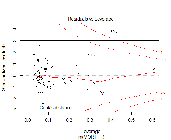
5bi. Cook’s distance

The rule of thumb is to cut off at 1 or at a relatively large value (Ramsey & Schafer, 2013). Observation 60 may be an issue.
Note: other measures of influence include
- DFFITS: influence of the ith case on the fitted value
- Cutoff is >1 for small/medium dataset,
: influence of ith case of each regression coefficient
- large absolute value indicates a large imapct of the ith case on the kth regression coefficient
- Expect high influence case to have large DFFITS and DFBETAS


5bii. Studentised residuals
The (internally) studentised residuals plot is shown. Externally studentised residuals can also be used and should be compared with 
Note: Internally studentised residuals are obtained using the “rstandard” function in R, while externally studentised residuals (deleted residuals) are found using the “rstudent” function.
According to Ramsey and Schafer (2013), we should compare to bounds of 
Hastie, Tibshirani, Witten and James (2013) suggest comparing to 
Observation 60 is an outlier in either case. We conclude that observation 60 “belongs to a population other than the one under investigation” and hence should be removed.
5biii. Leverage plot
The leverage plot is included below, with horizontal cutoff labelled, for sake of completeness. However, observation 60 was our only concern based on our interpretation of Cook’s distances and we removed observation 60 after we found its studentised residual to be excessively large. Hence, the leverage plot is not necessary for this analysis.

6a. Select model
Based on our earlier conclusions, we remove observation 60 and refit the model.

6b. Remark
I’ll feel that it is worth reiterating that ‘heuristic’ cut-off values can obviously lead to wrong conclusions. Try refitting models without potentially influential observations and notice changes in the output. You can always report the output of both.
7. Validity checks
We can attempt to answer the following questions, that will often be specific to the context of the problem.
- Is the model robust?
- Can it handle certain situations?
- Is it within safety requirements?
- Does it give appropriate suggestions?
8. Final regression model
We more have more data to check against before selecting our final regression model.
Appendix 1 – Alternative model by Ramsey and Schafer (2013)

Source: Display 9.9 from the 3rd Edition of The Statistical Sleuth by Ramsey and Schafer (2013), p.253 of Chapter 9: Multiple Regression
I thought this model was less detailed than the one from (Kutner, Nachtsheim & Neter, 2004), so I went with the latter model instead.
Notably, this process asks us to checks outliers each time a new model is fitted (steps 1 and 3).
The final two steps, “Infer” and “Presentation” will take place after the final regression model is found in our main article.
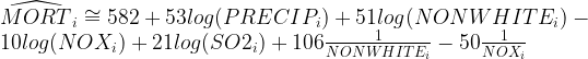
Appendix 2: Specific model in mind
Consider the case of measuring the volume of tree logs. They are in the form of a cylinder, so we expect the relationship:
Suppose we think that “R” and “H” are measured correctly and really want to check whether the constant term is consistent with 
We can run the following regression:

where

Suppose we separately test that
,

and do not reject the null hypothesis in each case.
Then,

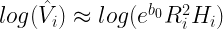
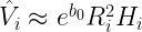
Then we can compare this to
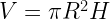
to see if

We may instead find that

This may mean the model more consistent with that of the volume of a cone, perhaps due to the way the heights of the trees were measured.
Appendix 3 – Added variable plots
Added variable plots are used to assess whether or not an additional explanatory variable should be added to a multiple regression model. They can be used as a less computationally intensive way to see whether additional variables are relevant compared to variable selection.
We may also use them after the model in step 5 or 6 is fit. For example, say we wanted to answer the question: “Is age relevant when a short term loan company decides how much they are willing to lend?” We would fit the best model we can without using age and then use an added variable plot to see if adding age to the model has significant explanatory power.
The added variable plots below indicate three cases:
(a) No additional useful information by adding X1, to the model beyond a model containing X2
(b) Non zero slope indicating that adding X1 may be helpful
(c) Adding X1 and we can also try to infer the possible nature of curvature effect (but partial residuals plots are typically more useful to study such functional relationships)

Source: Figure 10.1 from the 4th Edition of Applied Linear Regression Models by Kutner, Nachtsheim and Neter (2004).
Appendix 4 – Sources
The Statistical Sleuth. 3rd Ed. (2013) by Ramsey and Schafer
An Introduction to Statistical Learning: With Applications in R (2013) by Hastie, Tibshirani, Witten and James
Applied Linear Regression Models. 4th Ed. (2004) by Kutner, Nachtsheim and Neter
Applied Statistics (notes) by Tao Zou
Regression Modelling (notes) by Dale Roberts
